
Therapist Website for Neurodivergent Health Practice
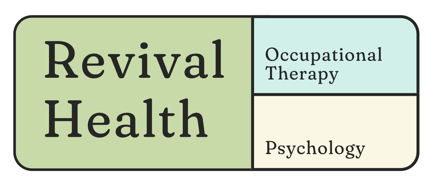
Revival Health PSYCHOLOGY & OT
Overview
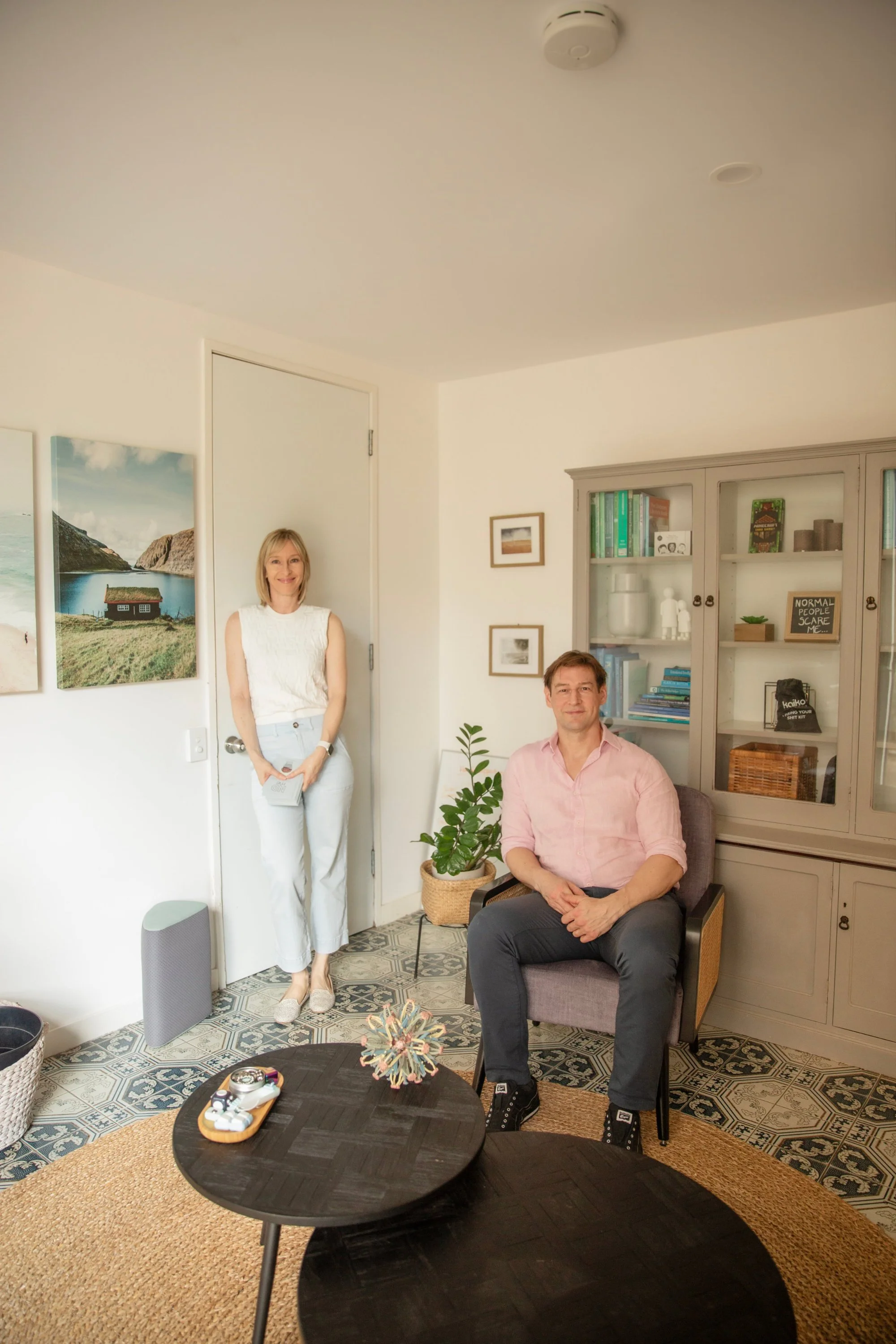
Revival Health is a Brisbane-based partnership practice led by Occupational Therapist Natalie Evans and Clinical Psychologist Dr Matthew Evans. Their work focuses on supporting clients with neurodivergence, persistent health conditions, and relationship challenges — drawing on both clinical expertise and lived experience.
As the practice evolved, they had developed a clear niche and depth of experience that was not reflected in their existing website or brand.
The Challenge Revival Health Faced
When Natalie first came to me, she felt their website was simply outdated and no longer engaging.
However, through early discussions, it became clear that the issue went deeper than aesthetics.
The existing website positioned Revival Health as a generalist practice, with no clear specialty or point of difference. In reality, the business had evolved significantly — with both Natalie and Matt developing a niche client base shaped by their clinical expertise and lived experience.
This gap between how the business had evolved and how it was being presented meant that the website wasn’t attracting or resonating with the right audience.
-
To realign the brand and website with the true positioning of the business — professional, specialised, and grounded in lived experience.
-
I recommended a rebrand as a critical first step to ensure the website could effectively communicate the new positioning. Natalie and Matt engaged Candice from Design Salad to lead the rebrand, creating a visual identity that is clean, calm and grounded.
Importantly, while the new brand provides a strong and appropriate foundation, it is not responsible for communicating the full depth of the business. That depth needed to be expressed through structure, content and user experience.
-
With the positioning clarified and the new brand in place, the website design focused on translating this into a clear, credible and easy-to-navigate experience.
The design prioritises:
Clarity and structure over visual noise
Strong hierarchy to guide users through complex information
Spacing and layout to reduce cognitive load
Rather than relying on visual design alone to communicate meaning, the site uses content structure and flow to express the depth of the practice.
Colour is used intentionally to differentiate the distinct arms of the business:
Revival Health (the overarching partnership)
Revival Occupational Therapy
Revival Psychology
This creates a clear and intuitive structure, helping users understand how the services relate to one another.
-
A key complexity of this project was designing for two practitioners within the same site — Natalie (Occupational Therapist) and Matt (Clinical Psychologist), who operate as a partnership.
Their communication styles differ significantly:
Natalie’s tone is more direct, practical and client-friendly
Matt’s is more detailed, analytical and explanatory
Rather than forcing consistency in the copy, the design system provides consistency through layout and structure.
This ensures:
Natalie’s content feels clear and accessible
Matt’s more detailed content remains structured and digestible
The result is a cohesive user experience that still allows each practitioner’s voice to remain authentic.
-
Both practitioners place a high value on providing detailed information, particularly for neurodivergent clients who often prefer depth and transparency.
The challenge was to support this without overwhelming users.
To address this, the website uses a layered content approach:
High-level information is presented clearly and concisely
More detailed content is revealed progressively through accordions
Lightboxes are used to contain complex or secondary information without disrupting the main flow
This allows users to engage with the content at their own pace, whether they want a quick overview or a deeper understanding.
The outcome
The final website accurately reflects the positioning of Revival Health as a specialised, professional, and relatable practice. Rather than appearing generalist, it now clearly communicates:
Who the practice is best suited to support
The depth and complexity of the work offered
A sense of credibility, safety, and understanding
The layered design and thoughtful structure allow clients to navigate complex information with clarity and confidence.
Natalie was initially unsure how the new brand would translate to the website, but seeing it come together, she is thrilled with the result — confident it reflects the expertise, lived experience and care that define Revival Health.
new squarespace website
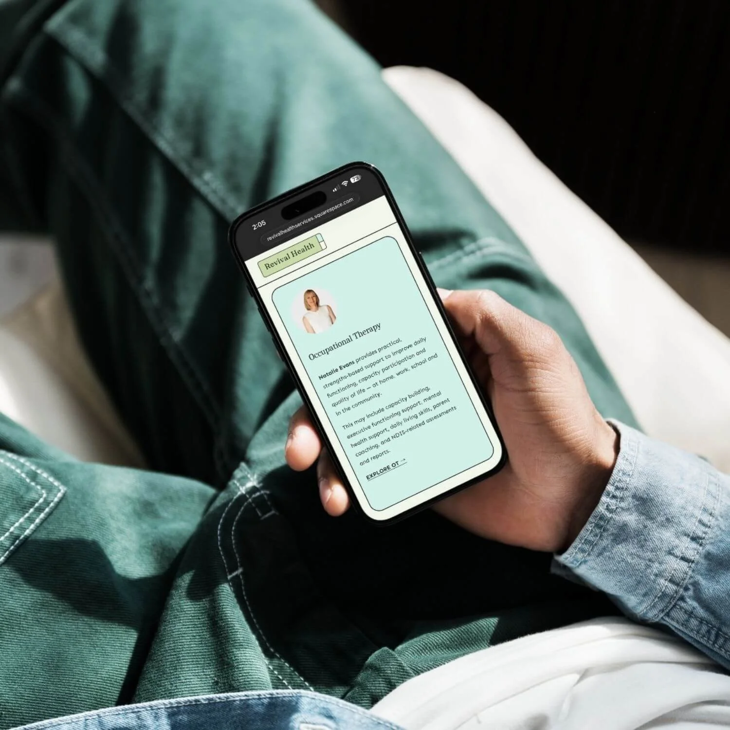
Person sitting with crossed legs, wearing jeans and a shirt, holding a smartphone displaying a webpage about occupational therapy and health services.
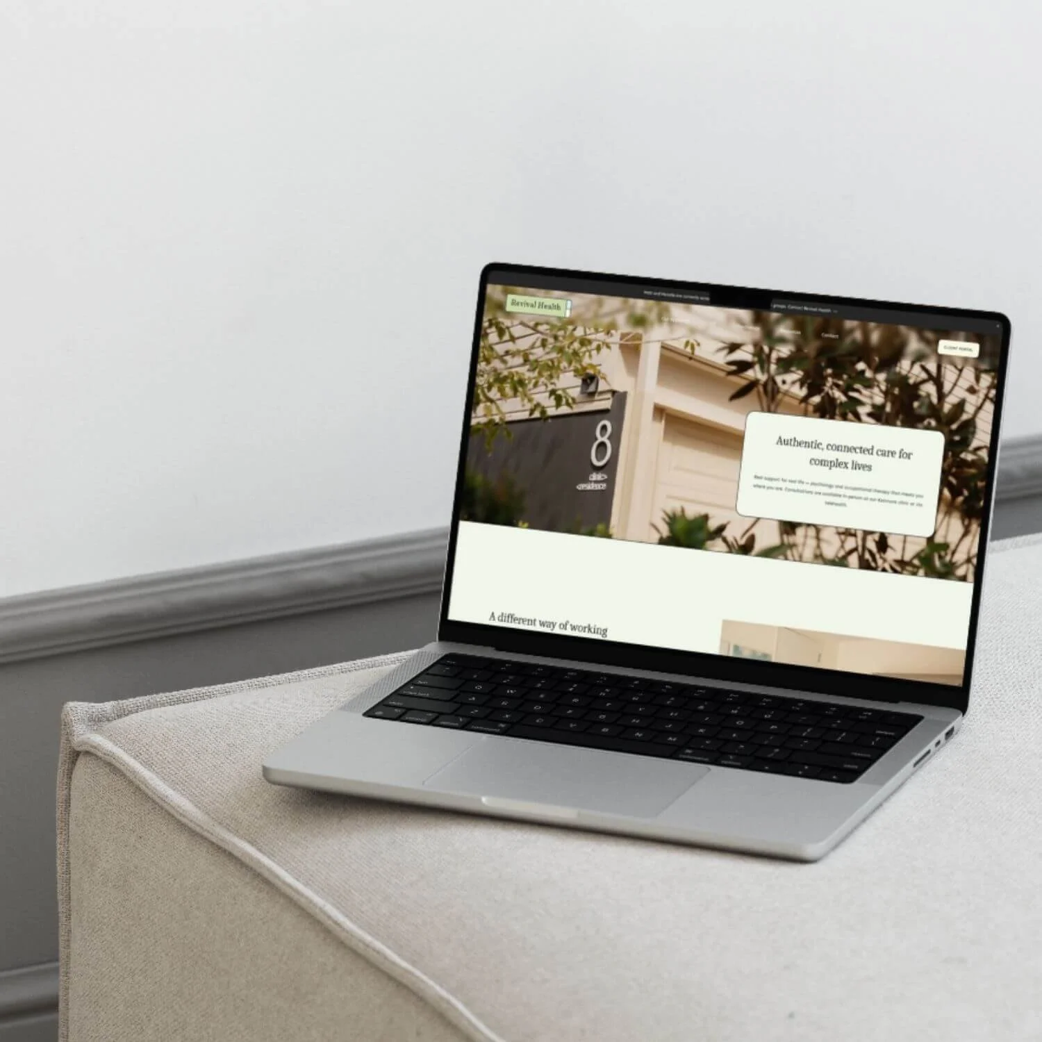
A laptop on a beige ottoman displaying a website with greenery in the background.
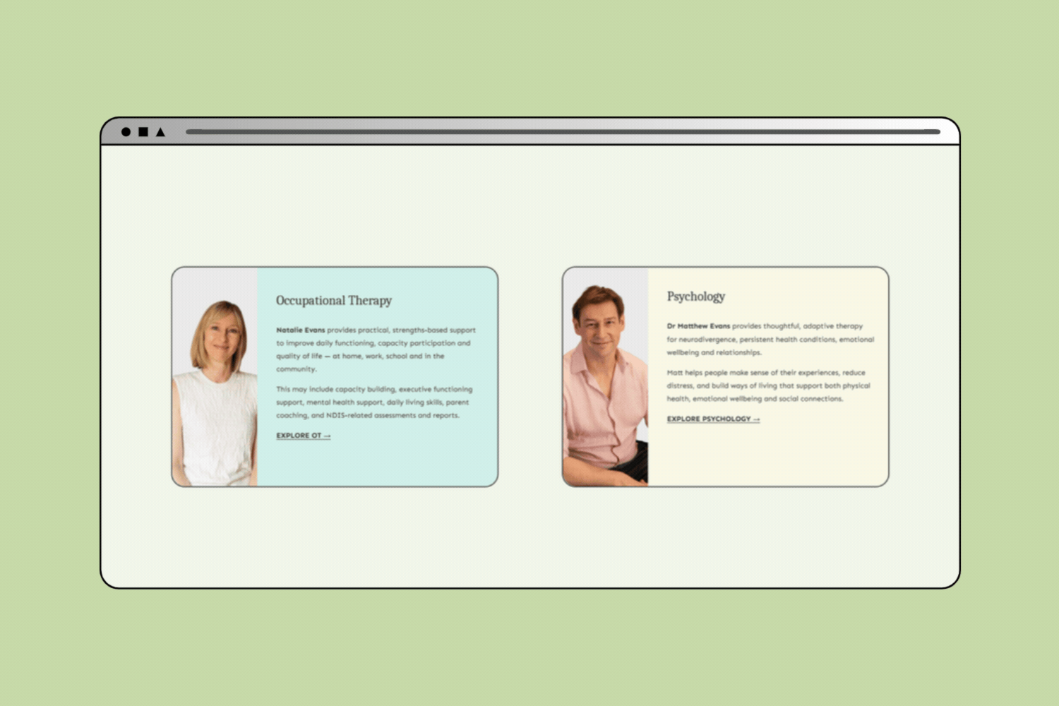
Webpage displaying two therapy service profiles. The left profile is for Occupational Therapy by Natalie Evans with a photo of a woman with blonde hair wearing a white top. The right profile is for Psychology by Dr. Matthew Evans with a photo of a man with brown hair wearing a pink shirt.
old Squarespace website
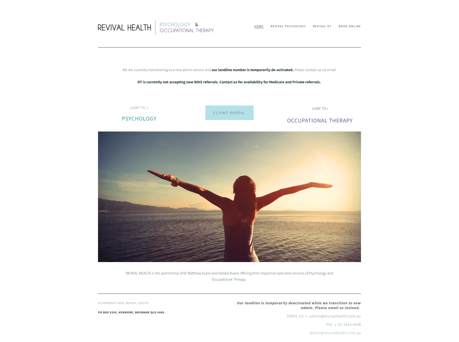
A person standing by the ocean during sunset with arms outstretched.
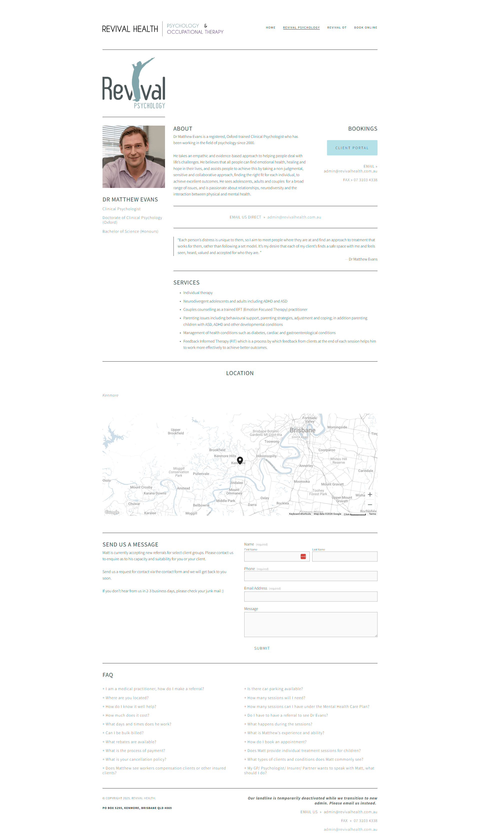
Screenshot of a mental health therapy website featuring a logo, photo of Dr. Matthew Evans, service offerings, location map of Brisbane, contact form, and FAQ section.
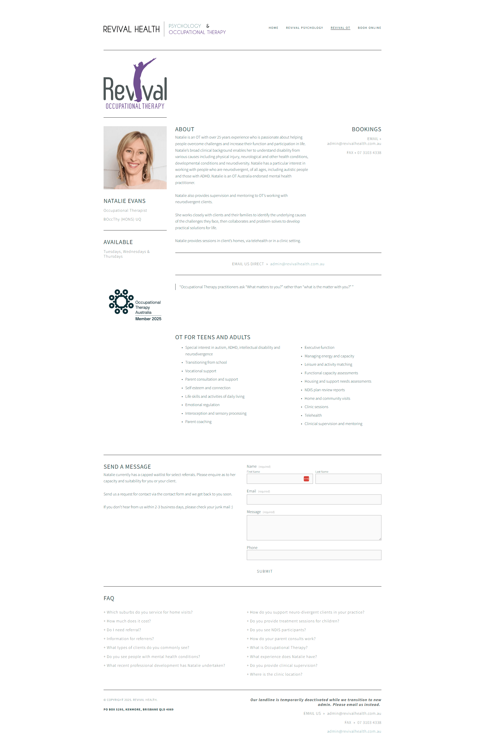
Screenshot of a website homepage for Revival Health, a psychology and occupational therapy practice. Contains a logo, navigation menu, a photo of a smiling woman, and information about services and contact details.
Like the look of what we created for Revival Health? If you're dreaming of a website that not only looks the part but helps grow your business too, take a peek at my Squarespace services or book a call to chat through what’s possible. I’d love to meet you and learn more about your epic business dreams.