


Squarespace website for opera singer and composer
Jessica O'Donoghue
Overview
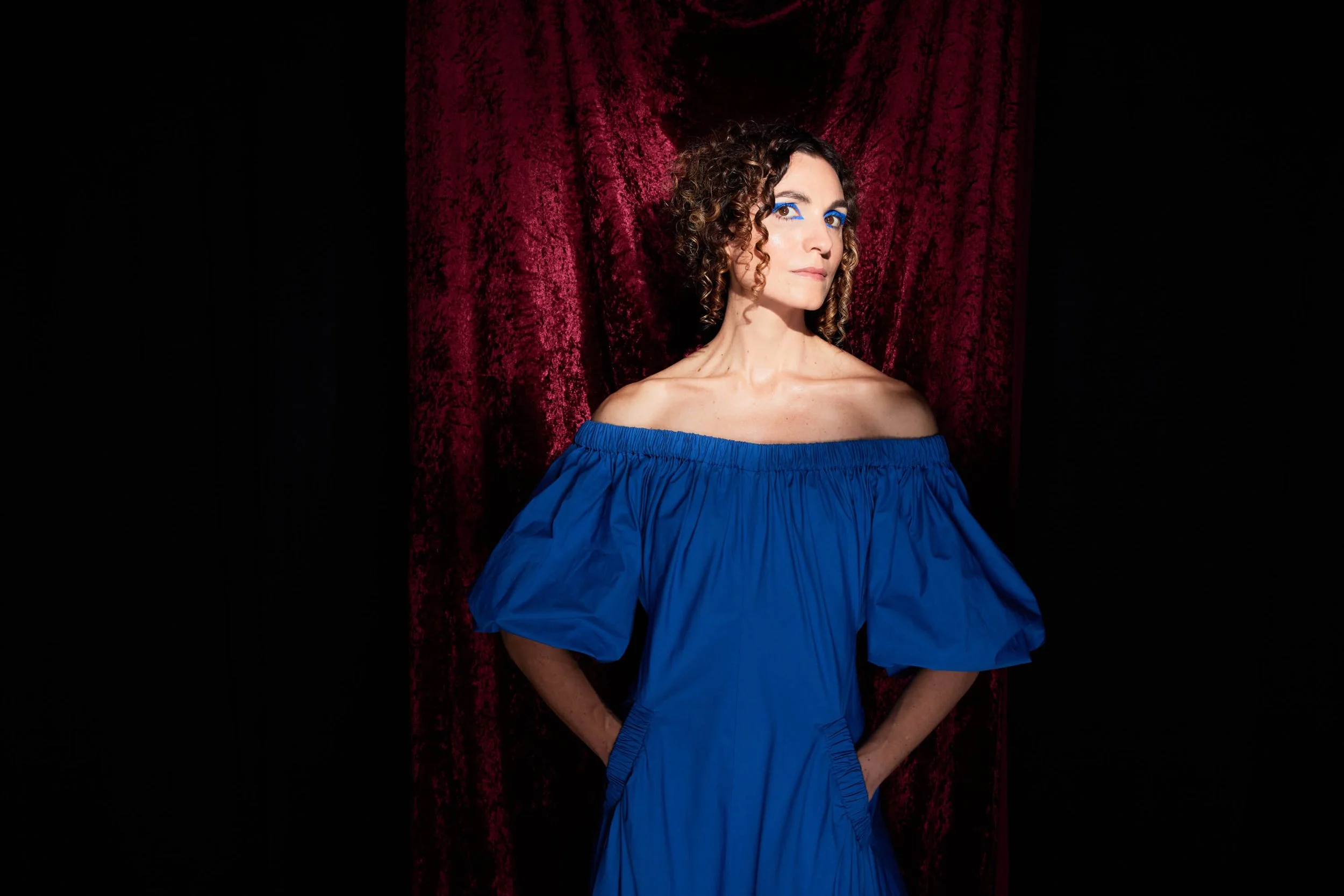
Jessica O'Donoghue is one of Australia's most distinctive voices in contemporary opera: a singer, composer, performer, and artistic director who specialises in new music and female-centric narratives. She creates and performs for some of the country's most prestigious institutions, including the Sydney Opera House and Sydney Chamber Opera, and her work includes composition, performance, recording, and artistic leadership. She also mentors emerging artists and works as an academic, making her one of the rare practitioners whose influence reaches well beyond the stage.
The Challenge Jessica faced
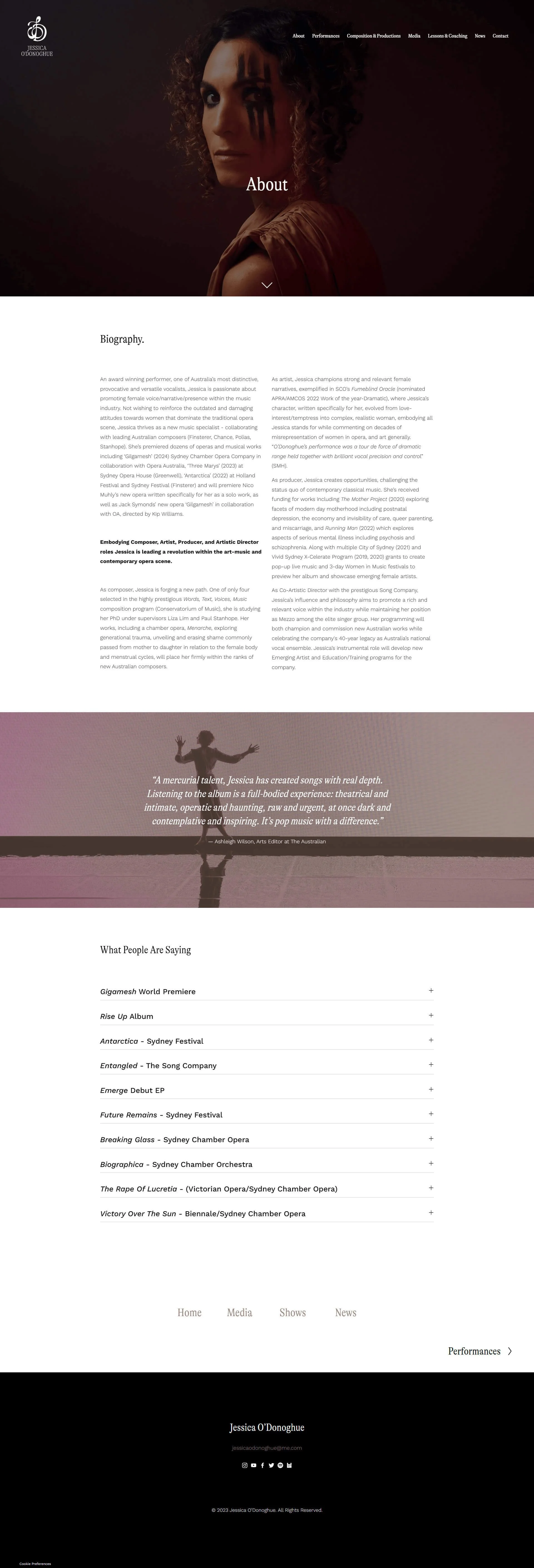
Jessica had stopped updating her website because she already knew it wasn't cutting the mustard and she had basically washed her hands of it! Built on Squarespace 7.0 years earlier, her career had grown considerably, and the site struggled to cover the breadth of Jessica’s work and accomplishments. Performances were buried in news-style event updates written for audiences who might buy a ticket, not for directors or production companies who needed to understand the depth of her body of work. All her audio, video, and supporting images lived on a single page called "Media," crammed together without context or hierarchy. Images were small. The limited Press reviews were buried in an accordion on the About page. There was no sense of what a production actually involved, or how ambitious and successful it had been.
-
Generate new leads: Attract the right opportunities across composition, performance, and artistic leadership
Increase brand awareness: Build a presence that reflects the quality and range of her work, so her name carries weight before anyone meets her in person.
Establish authority: Signal credibility through the calibre of her work, the institutions she has performed with, the press and awards she has earned.
-
Her biggest sticking point was organisational. How could one website clearly articulate the full picture of what she does? Composer, performer, recording artist, artistic director, mentor: each a real and distinct career in its own right. She was worried about how to bring them together without it feeling fractured or confusing.
She didn't need to have it figured out… that’s our job!
-
Repositioning the site for the right audience
The old site was written and structured for audiences: people who might see a show, buy a ticket, follow along as a fan. That's not who Jessica needs to reach. The new site is built for industry: opera directors, production companies, artistic peers, and collaborators who want to understand the full scope of her work and whether she's the right person for a project. That shift informed every structural and content decision we made.
Rebuilding the navigation around her skillset
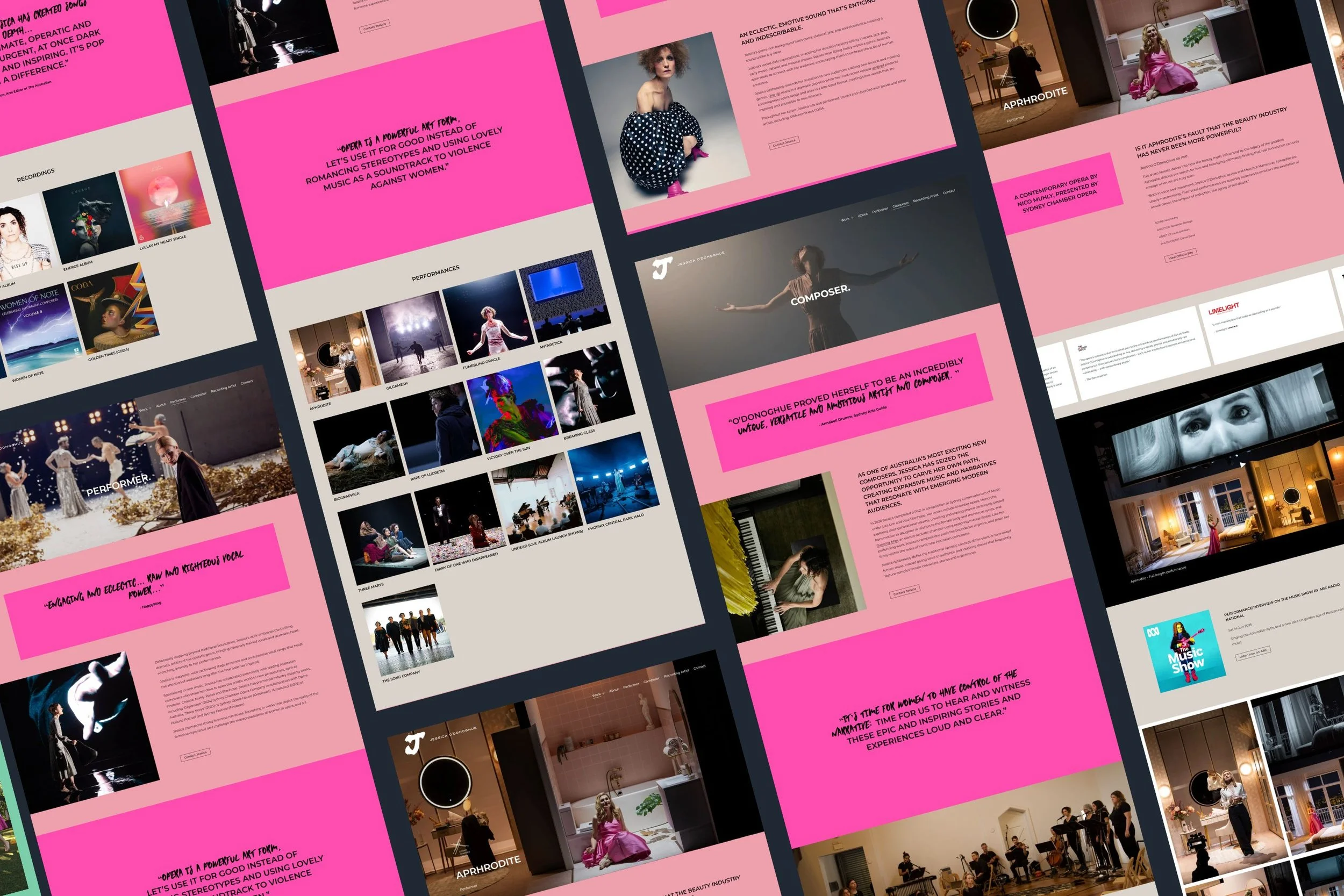
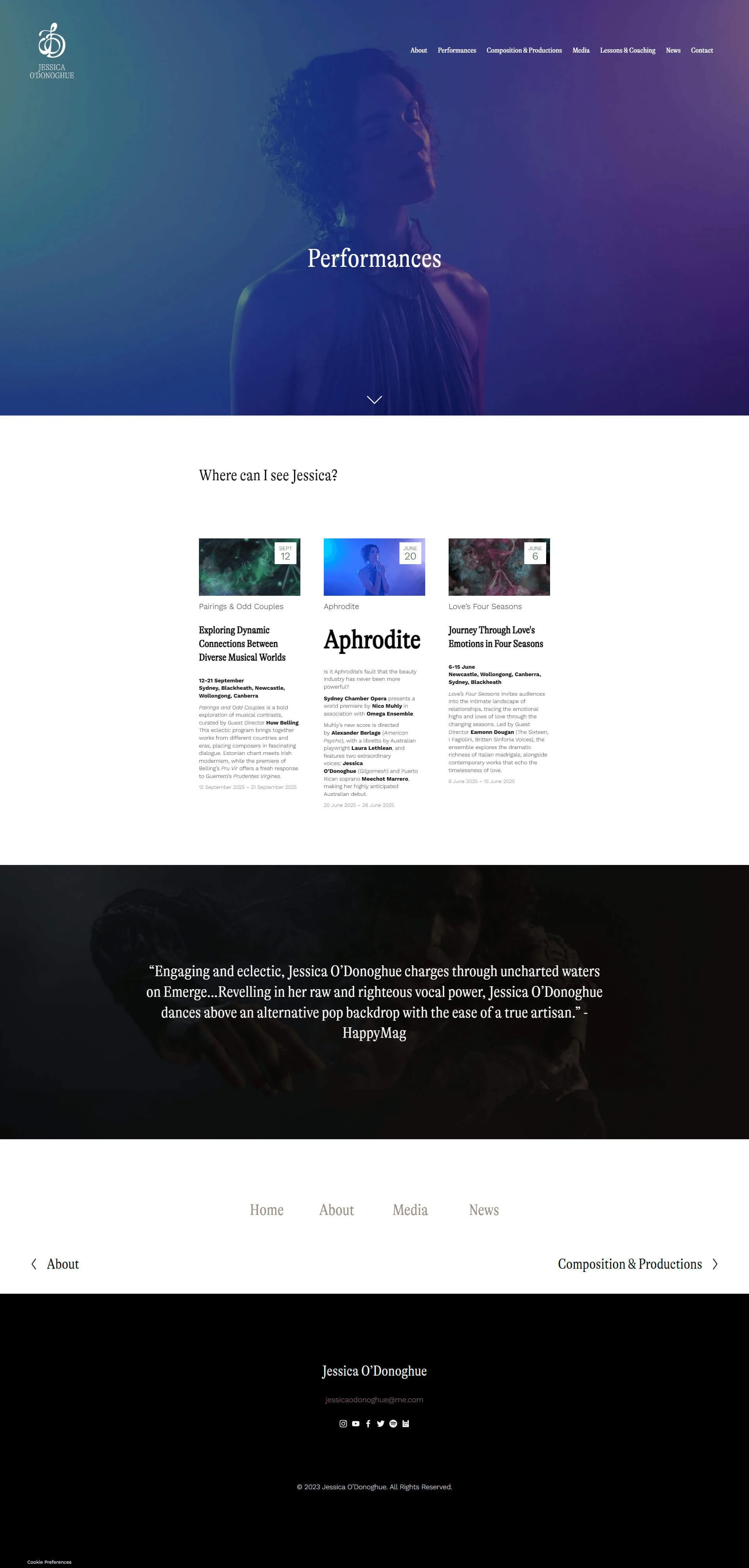
The old site had no clear structural logic. Visitors had no natural path through Jessica's work. The new navigation is organised around each of her skill areas: Performer, Composer, Recording Artist. Individual works sit as subprojects within each. If someone arrives knowing exactly what they want to explore, the Works dropdown takes them straight there. If they're discovering Jessica for the first time, the top-level structure gives them an immediate sense of the full scope of her career, and then invites them in further.
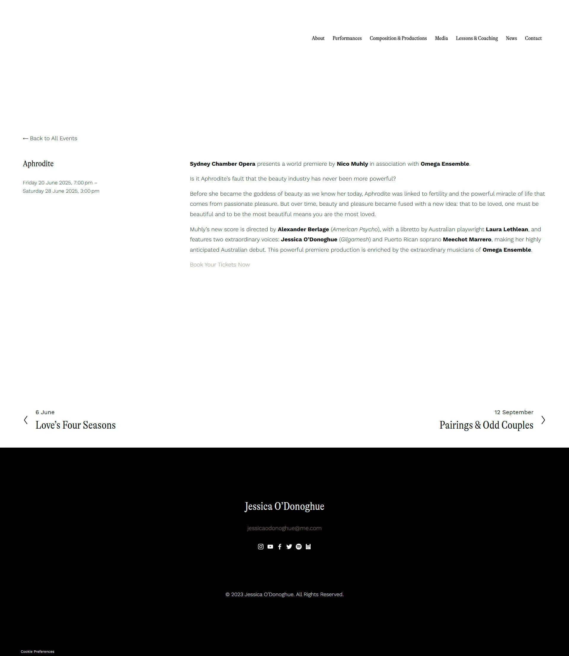
Giving every production its own complete story
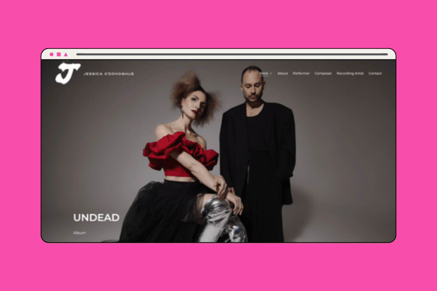
The most significant structural change was pulling all of Jessica's media out of a single page dump and giving every production its own dedicated page. Each brings together context, photography, audio, video, and press in one place. A visitor can get a high-level feel and move on, or go as deep as they want: watching, listening, reading. The scale of a production, the quality of a recording, the reach of a review: all of it lands the way it should. For a director or producer evaluating whether to work with Jessica, this is the difference between a resume and a body of evidence.
A design language that matches the work
Most classical music websites look like classical music websites: restrained, formal, a little stiff. We made a deliberate choice to do the opposite. The new site uses blocks of hot pink as a confrontational accent, editorial photography that owes more to fashion than to concert programmes, and a handwritten script font for press quotes that gives them personality and presence rather than relegating them to an accordion. Jessica's own words, and the words critics have written about her, are design elements. They stop you mid-scroll. The homepage heading, "Opera is not dead," sets the tone in the first three seconds. Nothing about this site looks like what someone expects from an opera singer's website.
Signalling authority through the work itself
Institutional logos, Sydney Opera House, Sydney Chamber Opera, Australian Media, sit prominently throughout. Generous white space gives her photography room to be the hero. Every production thumbnail in the grid is a doorway into a complete story. The new site demonstrates authority, page by page, production by production.
A brand identity that matched where she was heading
Jessica had an existing brand, but it wasn't communicating the disruptive direction she was ready to claim. We connected her with Design Salad to refresh the visual identity, giving the new site a visual language that matched the ambition and edge of her work. Grounded Copy pulled her story together across all skill areas, giving her a written voice that is as coherent and layered as the career itself, with a strong foundation to grow her composition work from.
-
The old site was something Jess had stopped looking at. The new one is something she can send to any director, producer, or collaborator, and they will know immediately they are dealing with an operatic powerhouse.
The site launched with every area of Jessica's work organised, presented at the level she is actually operating at, and built to stay current. She now knows exactly what assets to provide for each new production, and there are templates she can use to update the site herself or hand to us to take off her plate.
For someone as busy as Jessica, a reliable system is as important as the design.
-
I’m really stoked!!!
“Woo hoo!!! I LOVE it so much Jess, thank you, you’re AMAZING!!! And thanks for being so patient with me during the process. I’m really stoked!!!”
Jessica O’Donoghue

Website by Feel Good Creative. Brand by Design Salad. Copy by Grounded Copy.
Before: Squarespace website 7.0

Like the look of what we created for Jessica O’Donoghue? If you're dreaming of a website that not only looks the part but helps grow your business too, take a peek at our Squarespace services or book a call to chat through what’s possible. I’d love to meet you and learn more about your epic business dreams.