

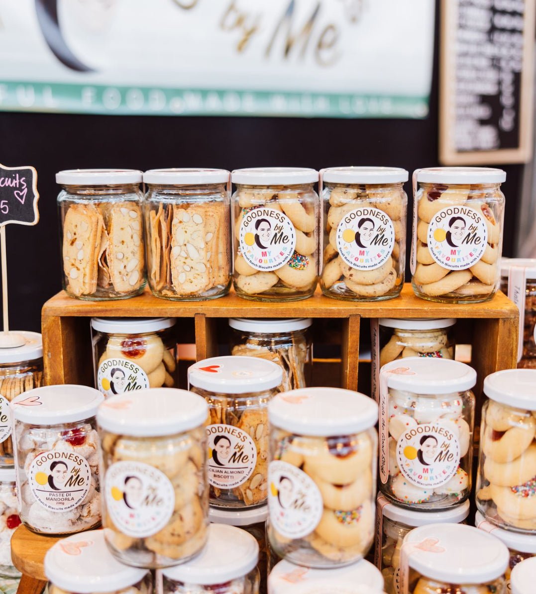
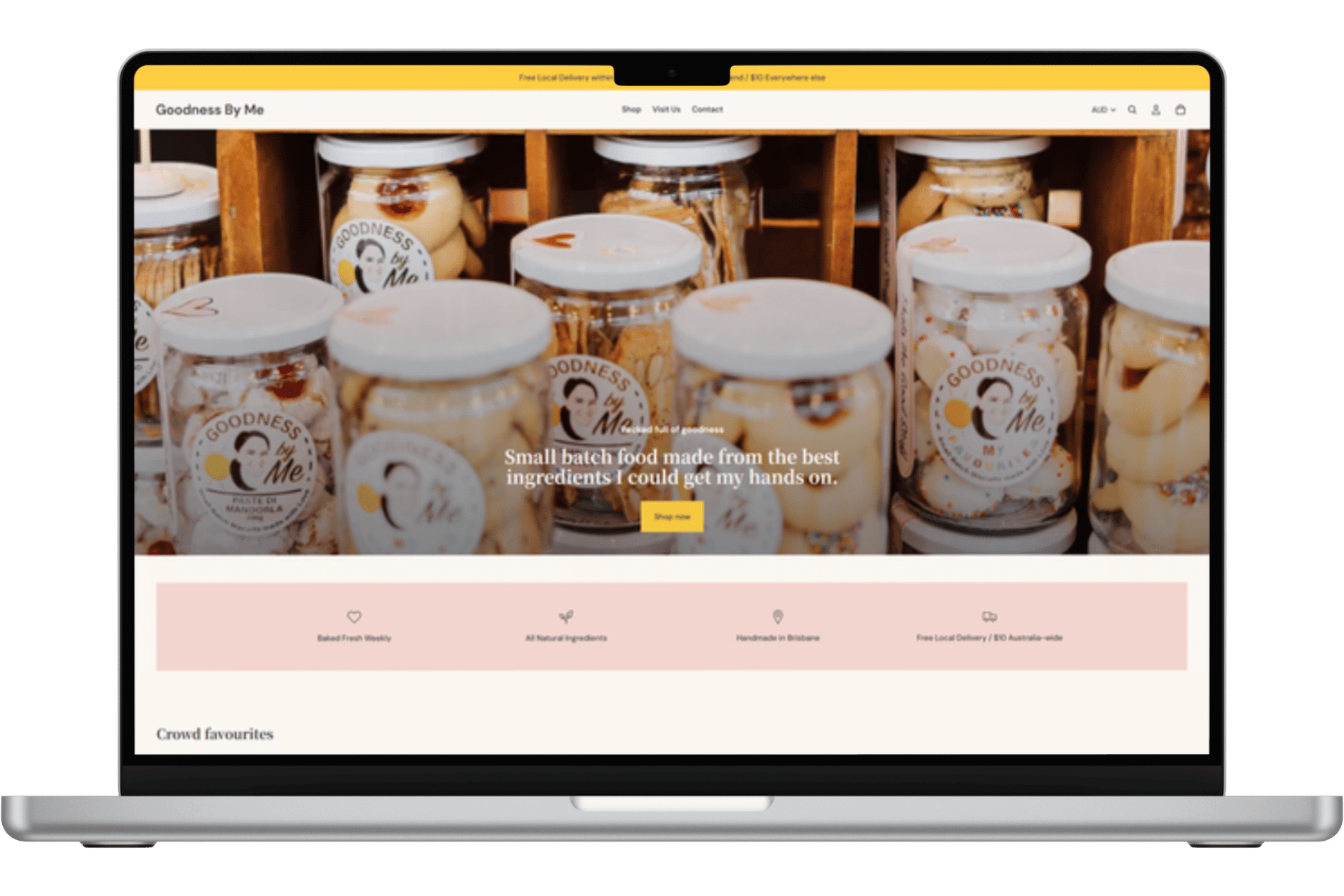
shopify website for food brand
Goodness by Me
Overview
Linda started Goodness by Me making granola for friends and family who kept asking for more. What began as one recipe has grown into a full range of granola, muesli, dukkah, nuts, biscuits and gift sets, sold mostly face to face at farmers markets across Brisbane. The online store has mostly been for market customers stocking up online when they can’t make it in person.
The Challenge Linda faced
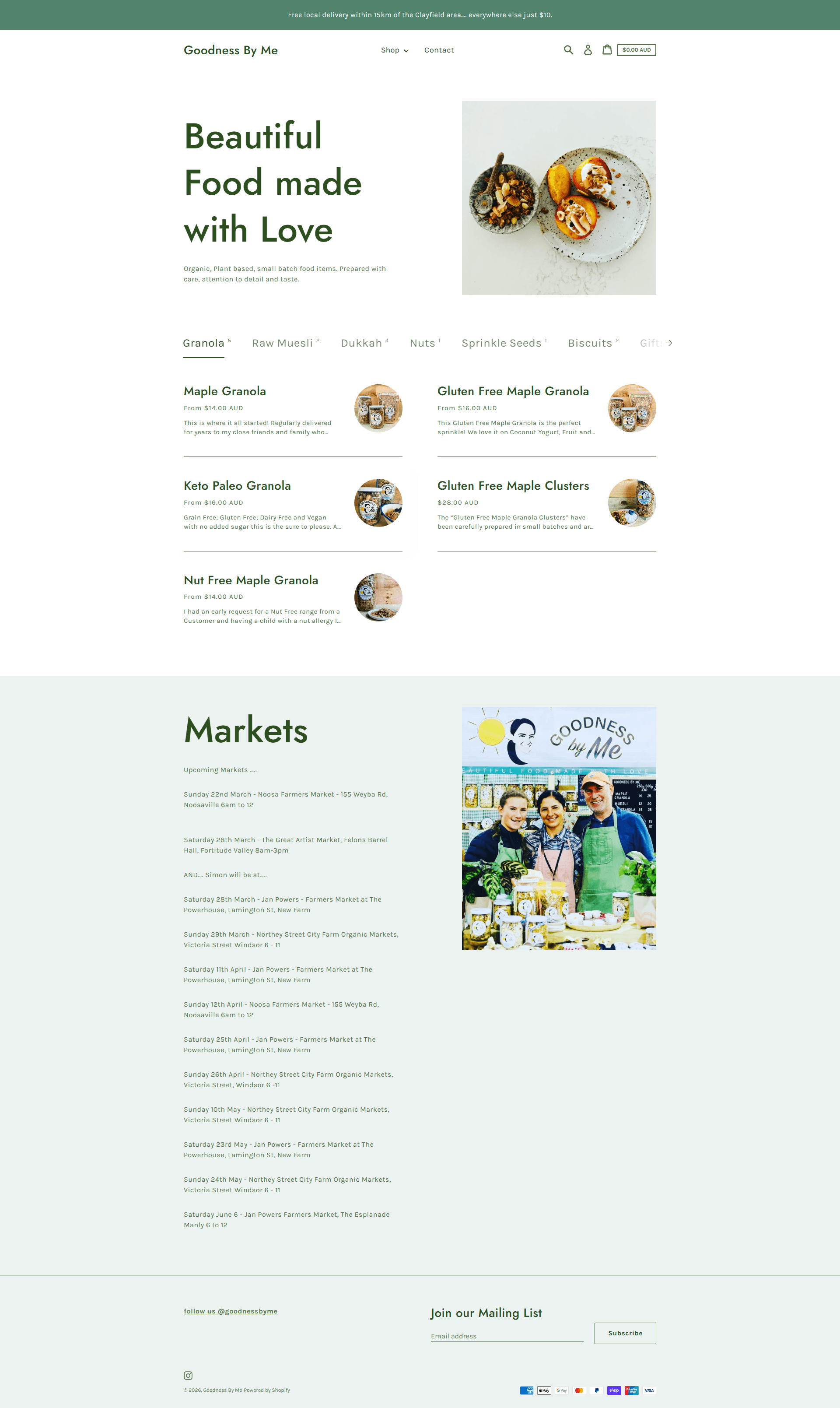
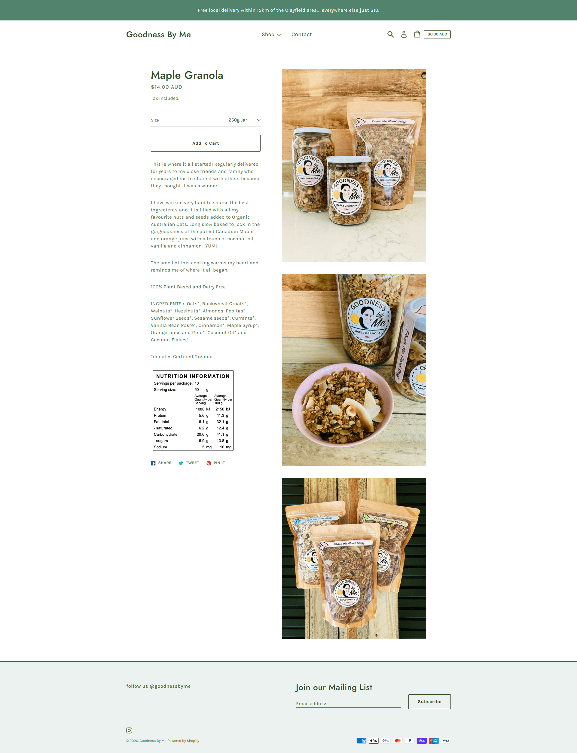
Linda had a Shopify store running on Express theme as-is out of the box. With a flat “All Products” menu lacking product categorisation, a home page that hindered product ordering, it took a regular customer to kindly provde some constructive feedback before Linda realised the DIY website was a problem that finally needed addressing.
-
Quick ordering: Rebuild the homepage so regular customers could bulk order their favourites quickly.
Organise products: Group the range into logical collections.
Overhaul product pages: Rebuild every product page around conversion best practice
Build trust and brand identity: This isn’t a new ‘hobby’ business!
-
Linda's biggest blocker wasn't technical. It was how she saw her online store. She'd built the business on markets, so the website had become a backup for regulars who couldn't make it that weekend, not a genuine sales channel in its own right. Markets will always be where she builds community and finds new customers, but they're exhausting and weather dependent every single time.
That belief is still one she's working through. What actually got her to act wasn't a change of heart, it was a customer taking the time to flag real problems with the site. It was enough to prompt the redesign, even if the bigger mindset shift, seeing the website as a second, reliable sales channel rather than a fallback, is still a work in progress.
-
Restructuring navigation and collections around how customers shop
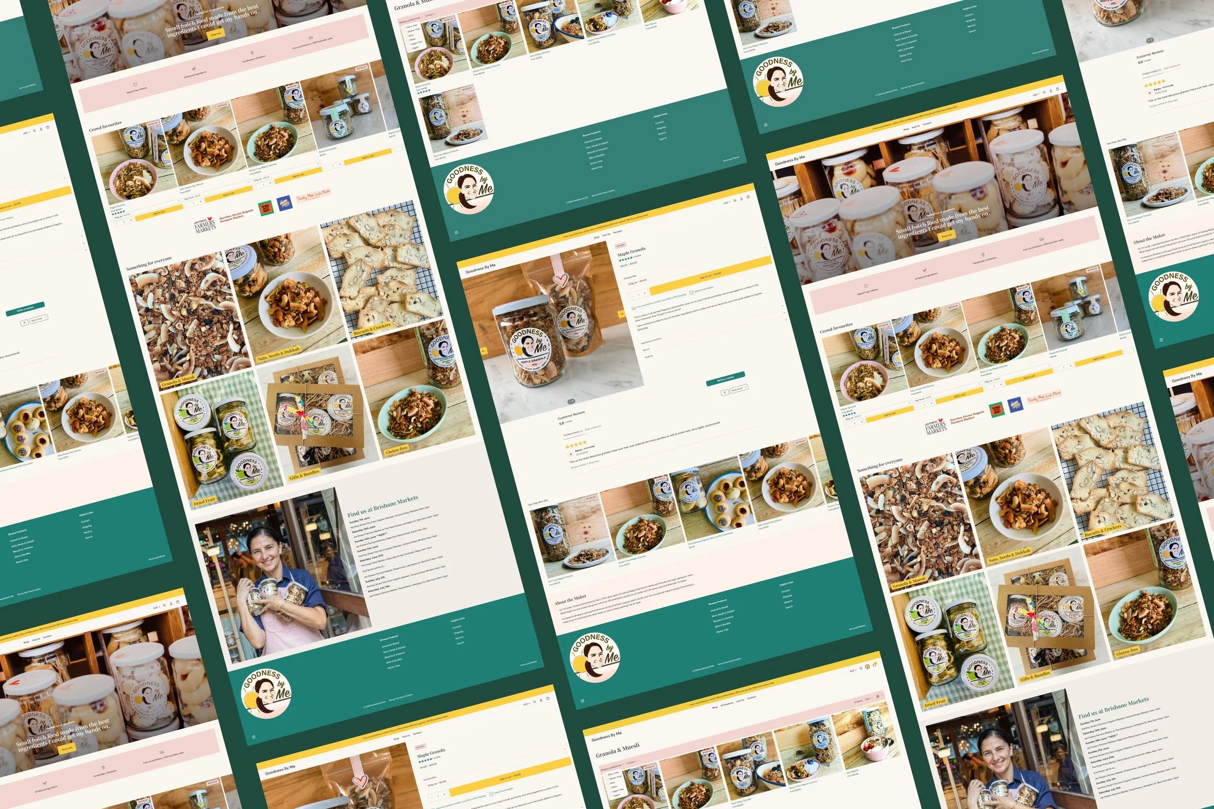
We built a Shop dropdown grouped into Granola & Muesli, Nuts, Seeds & Dukkah, Biscuits & Crackers, and Gifts & Bundles, managed by smart collections that update automatically as new products are added.A homepage built for quick ordering
We reordered the homepage around a clear path. Hero, then a USP strip, then Crowd Favourites so returning customers can add their usual order without hunting for it, then a category grid for anyone browsing for the first time, and then the market schedule for in person shopping.Badges and labels doing the dietary heavy lifting
With products spanning gluten-free, nut-free and keto-paleo ranges, we built custom Bestseller, New and Gluten-Free badges plus metafield-driven dietary and allergen labels, so customers can spot what suits them at a glance.A product page built to answer objections
We split the product information to suit quick scanners and visitors who want more detail. Price, pack size, trust signals and the add to cart button sit up top, with just enough description visible to sell the product. Ingredients, nutrition, returns and shipping moved into accordions. They're still one click away, but no longer standing between a customer and "add to cart." Star ratings and customer reviews were added, giving new visitors social proof. Each page closes with related products and Linda's own story.Brand identity
There was no formal brand kit to draw from, so the site's colour palette came straight from Linda's existing logo, her packaging, and the warmth of her market stall photography. -
Subscription ordering (recommended!): A recurring subscription option for her granola range. Right now, if a regular can't make it to a market, the sale doesn't just wait a week. It's a real risk of losing that customer to whatever's on the supermarket shelf when their jar runs out. A subscription means the order keeps arriving whether she's at a stall that weekend or not.
Product image and description refresh: Rolling updates to copy and images as she has time between baking to optimise conversion.
-
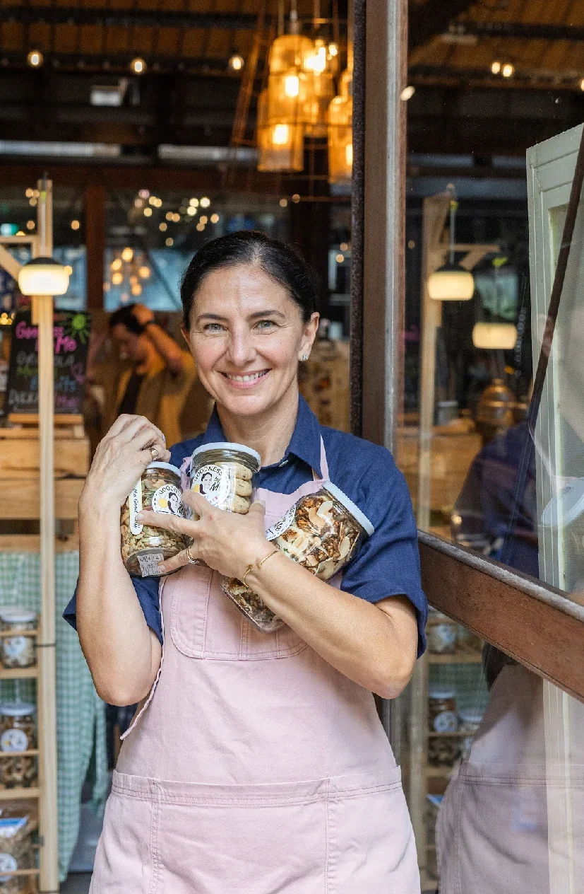
[Jess] was totally invested
Jessica completely transformed my website to a warm and welcoming design and flawless functionality. Wonderful to deal with, she was totally invested in a successful outcome. Thanks so much Jess."
Linda, Goodness by Me
Before: Shopify website
Like the look of what we created for Goodness by Me? If you're dreaming of a website that not only looks the part but helps grow your business too, take a peek at our Shopify services or book a call to chat through what’s possible. I’d love to meet you and learn more about your epic business dreams.