


Squarespace website for Brisbane architect
Frame Architectural
Overview
We created a Squarespace website for Frame Architectural, a solo residential architecture studio based in Brisbane. Frame Architectural specialises in thoughtful, client-focused design across new builds and renovations. Every project is shaped around the client's needs, with a strong focus on functionality, context, and longevity — resulting in spaces that feel genuinely personal rather than tied to a set style.
The Challenge Frame Architectural Faced
Frame Architectural had outgrown its DIY WordPress site. Architect Lachlan Joseph reached out to me, looking for a new online presence that would generate more leads and improve organic search visibility. The existing website failed to communicate the studio’s thoughtful approach to design—one that prioritises client needs while balancing context and longevity.
-
Flying under the radar
While the old website had a small gallery of project images, it wasn’t enough to showcase the depth and impact of Frame Architectural’s work. No case studies highlighted the collaborative process or the value added to each project.
The site’s design also wasn’t keeping up with evolving technology. It wasn’t responsive across different screen sizes, making it feel clunky, basic and outdated. In an industry where aesthetics and attention to detail are critical, this was a significant issue. Lachlan is modest and reserved, but his understated approach to Frame Architectural’s online presence limited his ability to attract new clients.
-
Squarespace was the ideal platform for Frame Architectural. Its built-in design flexibility made it easy to create a clean, editorial-style layout that places the spotlight on Lachlan’s architectural photography. Originally developed with photographers in mind, Squarespace is brilliant for showcasing high-quality visuals — perfect for a visual-first business like Frame.
The platform’s built-in SEO tools, easy-to-navigate structure, and flexibility in customisation were key in ensuring the site would not only look stunning but also perform well in search engine rankings.
It also offers Lachlan a seamless, stress-free way to update his own portfolio with new work as it launches, giving him independence and keeping his site fresh with minimal effort.
-
Lachlan wanted to work with someone who shared his collaborative, egoless approach. Our discovery call helped establish that trust, as he quickly felt at ease with our natural, non-salesy conversation. He appreciated the “good balance of fun and professionalism” and knew we’d be a good fit to work together.
Interestingly, Lachlan’s experience during our call reinforced a key point I wanted to drive home—his website needed to feel the same way. Just as Frame Architectural’s design process is client-focused, the website needed to be equally inviting and easy to navigate, guiding potential clients rather than making them feel lost. People buy from people.
-
Many architects hesitate to add too much content, believing minimalism is always better. There’s also a tendency to design websites with industry peers in mind rather than potential clients.
I explained to Lachlan that a website shouldn’t feel like a portfolio for other architects—it should be a service-focused tool that helps clients make informed decisions. The shift came when we reframed conversion techniques as a form of guidance rather than self-promotion.
-
The previous website followed the typical “less is more” architect philosophy—it was sparse, monochromatic, and minimal. While clean, this approach left potential clients with too many unanswered questions.
To maintain a refined aesthetic while improving usability, we incorporated:
A sticky, always-present “Contact” button in an accent colour, reducing the need for repetitive contact links.
Testimonials within accordion dropdowns, allowing praise to be displayed discreetly without cluttering the design.
A carefully selected accent colour to create subtle visual interest while maintaining Lachlan’s refined style.
These small but thoughtful additions reassured Lachlan that usability and aesthetics could coexist.
-
A key improvement was the introduction of project case studies. These allow Lachlan to highlight the types of clients he works with, the challenges he solves, and the real-world impact of his designs.
We created a case study template that makes it easy for Lachlan to document new projects consistently. This ensures his website remains up-to-date and aligned with his evolving portfolio.
-
Many architectural firms stick to neutral palettes, making their online presence blend together. I encouraged Lachlan to introduce a subtle accent colour as a way to differentiate Frame Architectural. Thoughtful use of colour added depth and personality without overpowering the project imagery.
-
Just as Frame Architectural takes a client-first approach to design, the new website was built to put the user experience first.
The layout is structured to guide potential clients through the site seamlessly, answering key questions before they even need to ask.
Case studies and testimonials provide social proof, reinforcing Frame Architectural’s expertise and collaborative approach.
Thoughtful, client-focused copy reflects the same personalised approach the studio takes in its projects.
-
Beyond design, we implemented SEO improvements to help Frame Architectural rank better in organic search results. These included:
Strategic keyword optimisation across the site.
Client-focused copy that answers common questions and improves search relevance.
A structured case study format, adding fresh, high-value content over time.
Google Business Profile optimisation to enhance local search visibility.
With these changes, the website is now more discoverable by potential clients searching for Brisbane-based residential architects.
-
The new Squarespace website is a welcoming invitation for prospective clients. It provides clear, intuitive navigation, detailed project insights, and easy ways to get in touch.
The SEO improvements have strengthened Frame Architectural’s online presence, making the studio more searchable and competitive. More importantly, the site now reflects who Lachlan is—approachable, confident, and highly capable.
In Lachlan’s own words, the transformation has given him the confidence to engage with potential clients without worrying that they’ll judge his business based on an outdated site. He now has a digital home that is both functional and a true representation of his work.
One Year On
Six months after launching the new website, Lachlan saw a steady flow of quality leads. The site's increased visibility and professionalism allowed him to be more selective with the projects he took on. In his words, “the new website was the best thing I did for my business.”
Whether a potential client found him through search or a referral, the website provided a strong point of reference—giving them confidence in his work before they even reached out. Over time, it became clear that a well-crafted website is one of the most valuable assets a designer can have.
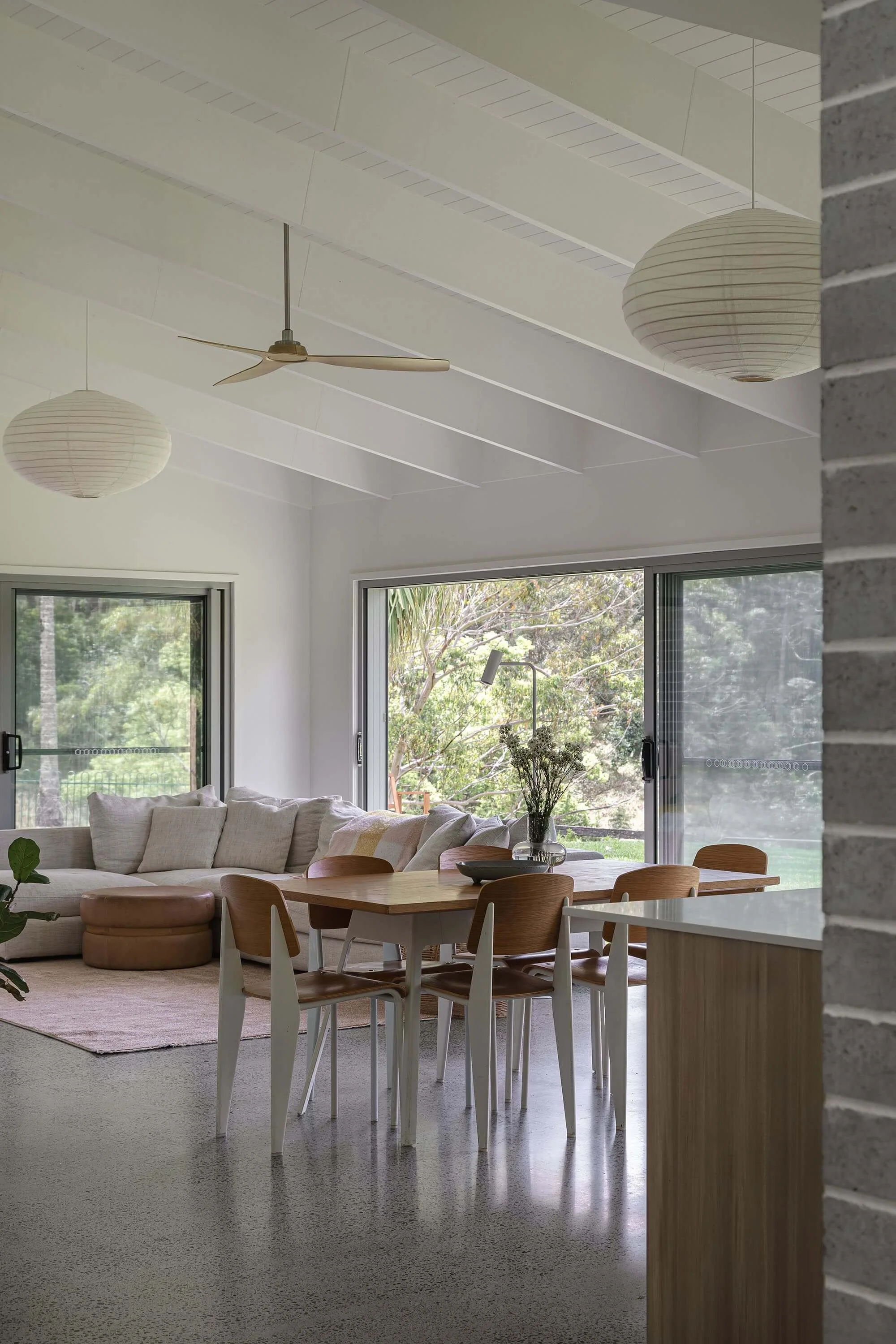
Now (2025), Lachlan wants to build on this success. With more project imagery and case studies, we have refreshed his homepage to showcase multiple projects, making the first impression even more visually engaging—especially on mobile. During the Design Day, we also refined the typography and accent colours.

From Lachlan Joseph, Frame Architectural:
Working with Jess was a fun and enjoyable experience and she delivered us an awesome new site to showcase our architectural work, and to also convey in a more effective way, who we are and what we do.
Jess understands small business really well and has helped tie together our website and business goals. Although I thought I had a pretty strong idea of how I wanted our site to look and feel, she offered some really valuable critique and design insight, which I took onboard and I'm so glad I did.
From start to finish, her communication, passion, and working approach made the project a breeze.
I feel more confident to talk to new clients and share more information about my business, without the fear of them looking at an outdated site and making their minds up/judging me based on that. I also feel that it gives me a better online presence (more google-able), and more level with competitors.
Even the tradies think it’s “mint”
The updated homepage makes the most of stunning new project photography. To keep the look minimal whilst balancing user friendliness, we introduced a two-layered navigation system: a consistently visible dark main menu, and a secondary navigation in lighter text. This ensures that, at any given point, navigation is clearly visible over the changing photo backgrounds.
Instead of a typical auto-scrolling carousel, the new homepage uses horizontal scroll that reacts intuitively to mouse wheel or touchpad swipe. This gives users full control of their viewing experience — no pesky auto-scrolls or disjointed transitions — just smooth, elegant image browsing.
On mobile, the gallery scrolls vertically, with image heights that vary just enough to keep things feeling organic and interesting.
Within a week of launching the refreshed homepage, Lachlan received an enquiry from a builder who’d just redone his own website and was clearly impressed. His feedback?
“Your website is mint.”
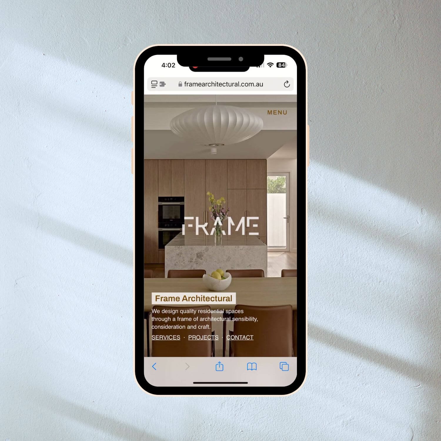
Smartphone displaying the Frame Architectural website homepage, featuring a modern kitchen with wood cabinetry, a central island, and a large white pendant light. The page includes navigation links for services, projects, and contact information.
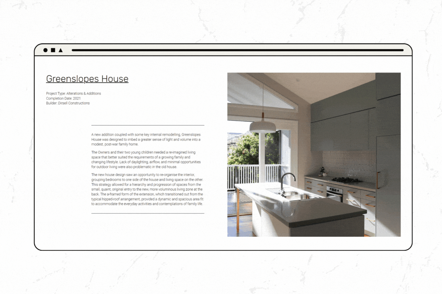
Squarespace Web page design for Frame Architectural featuring Greenslopes House project with text and an interior kitchen photo.
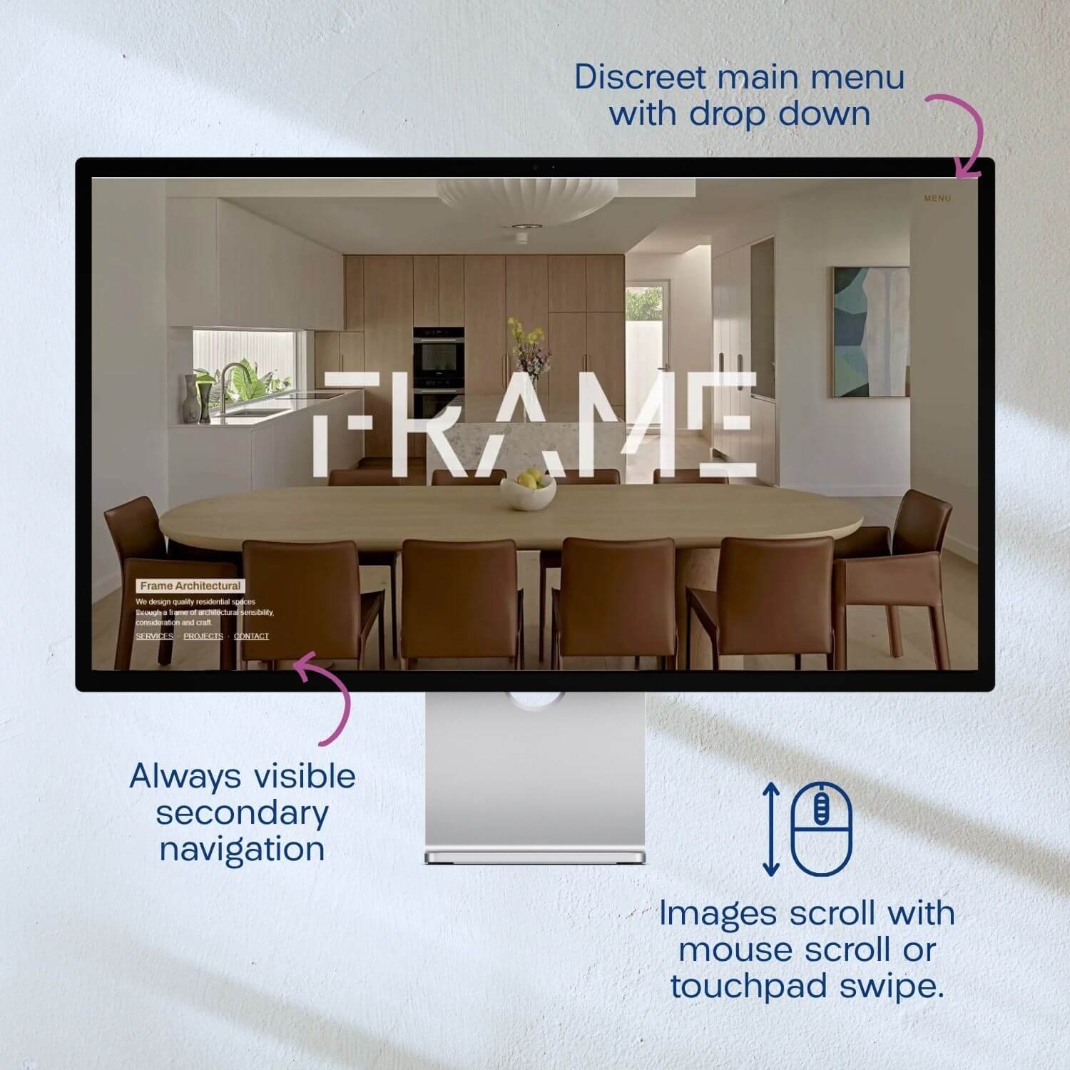
A computer monitor displays a website homepage featuring a modern dining room with a round table and chairs. The screen shows text labels indicating website features: a discreet main menu with dropdown, always visible secondary navigation, and images that scroll with mouse or touchpad. The room has minimalist decor and natural lighting.
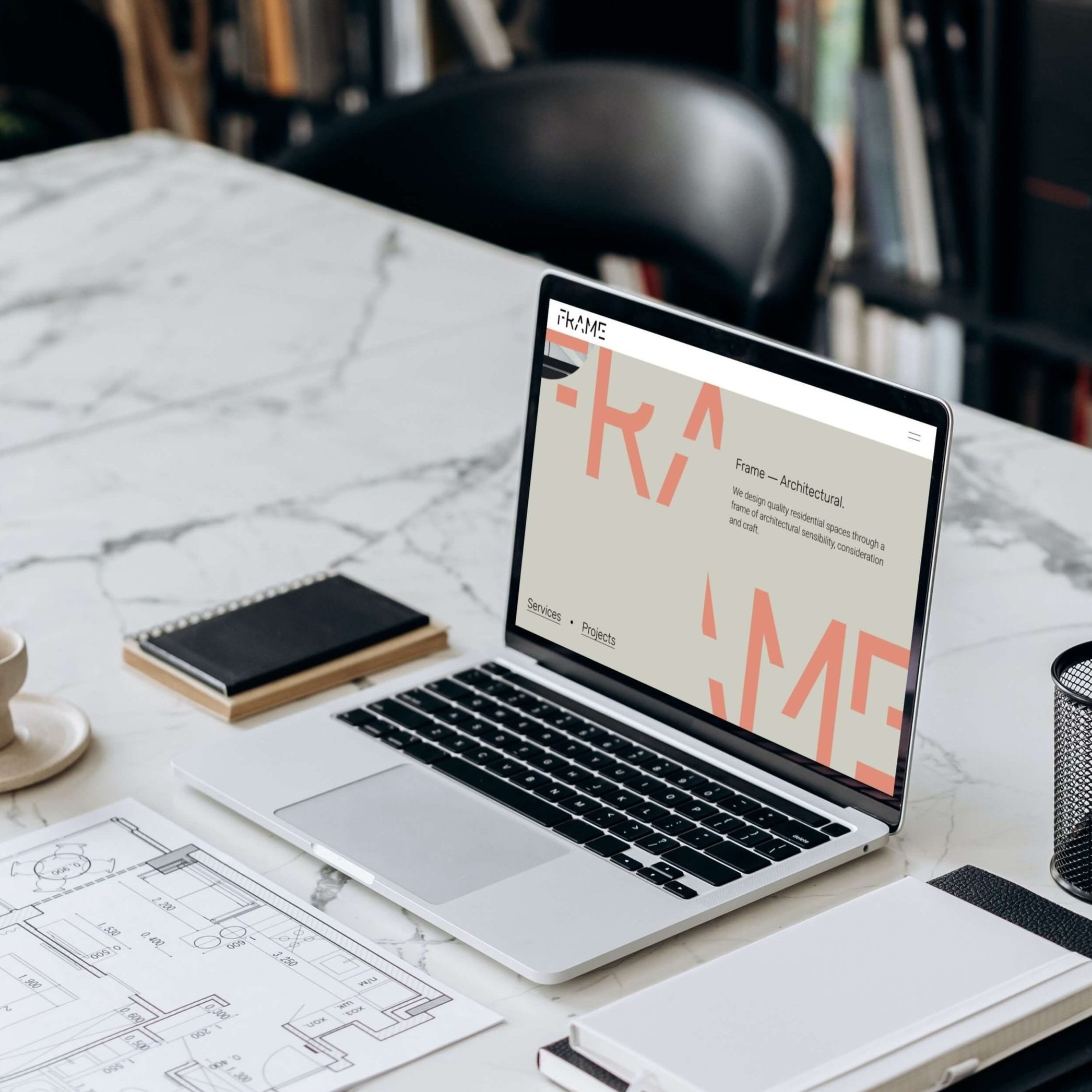
Open laptop on a marble desk displaying an architectural website, surrounded by a notebook, electronic device, paper with floor plans, and a pen holder.
Before: wordpress website
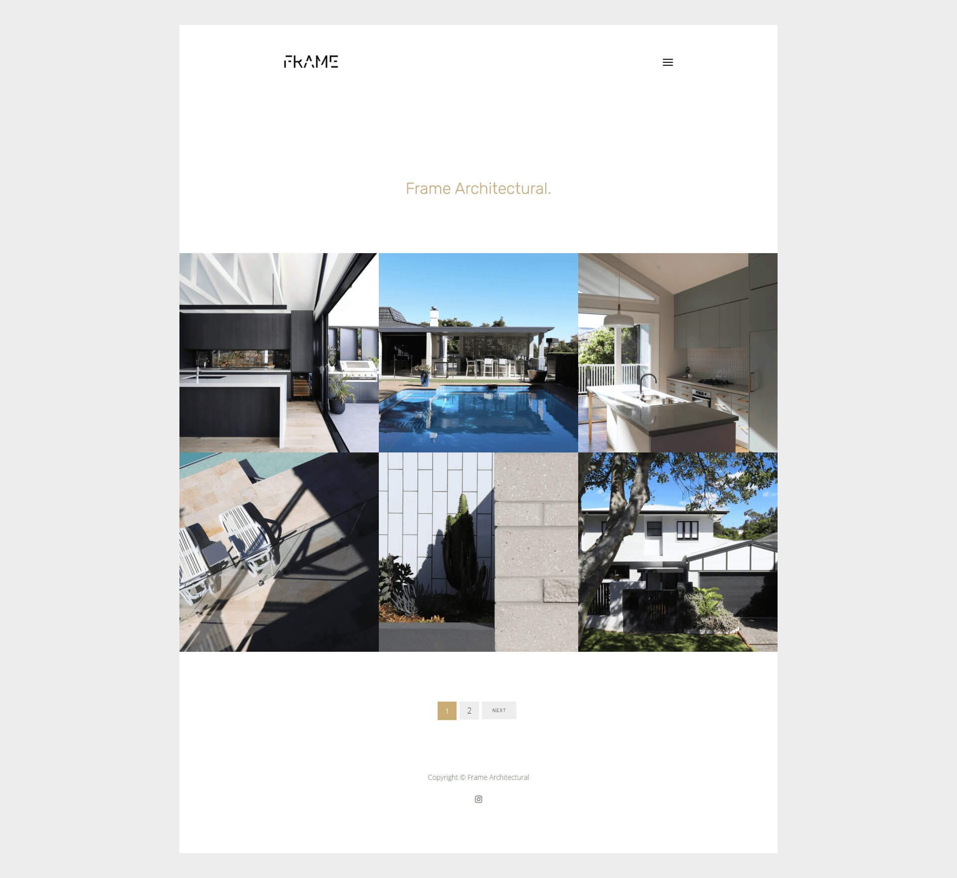
Home Page
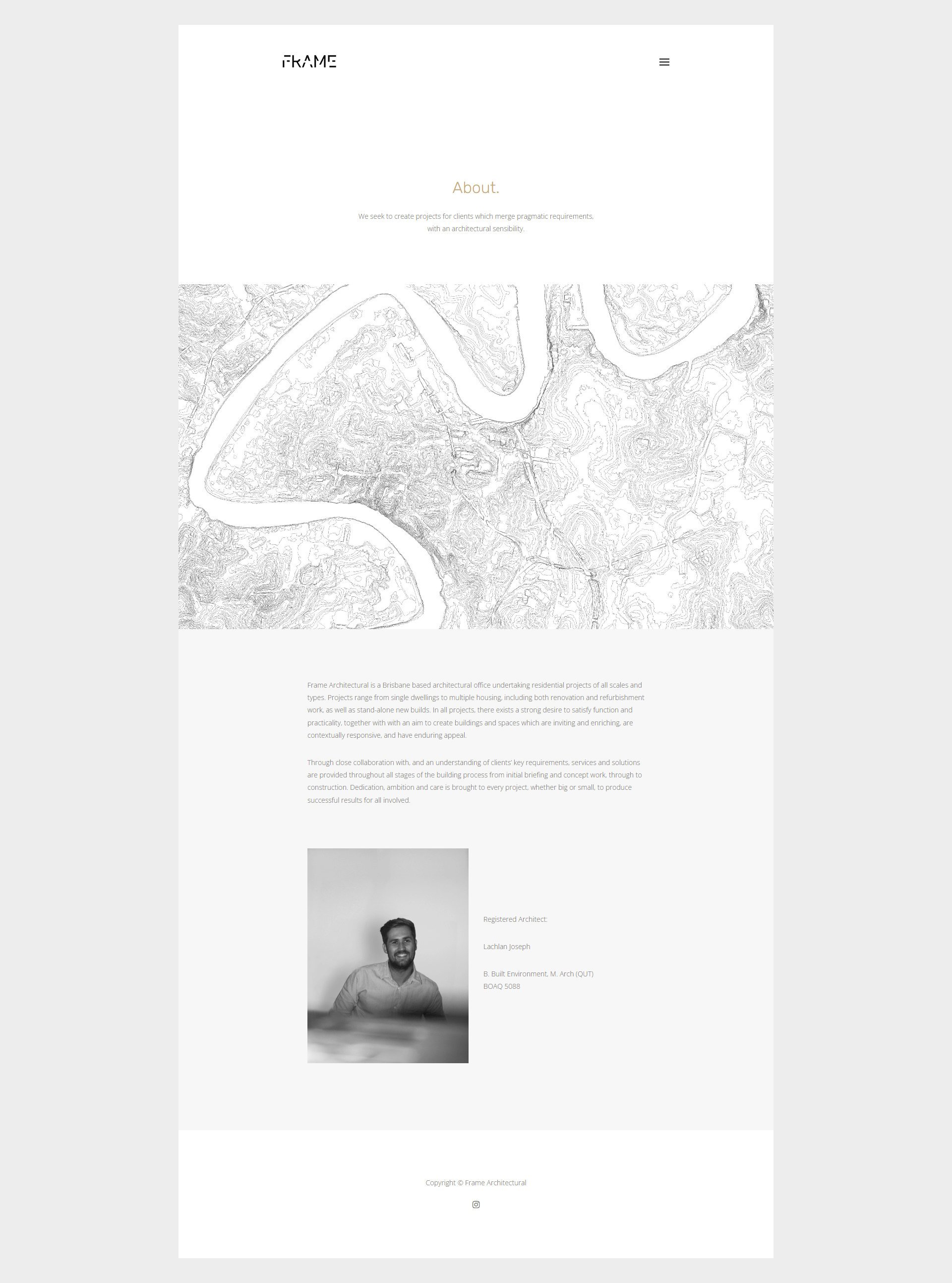
About Page
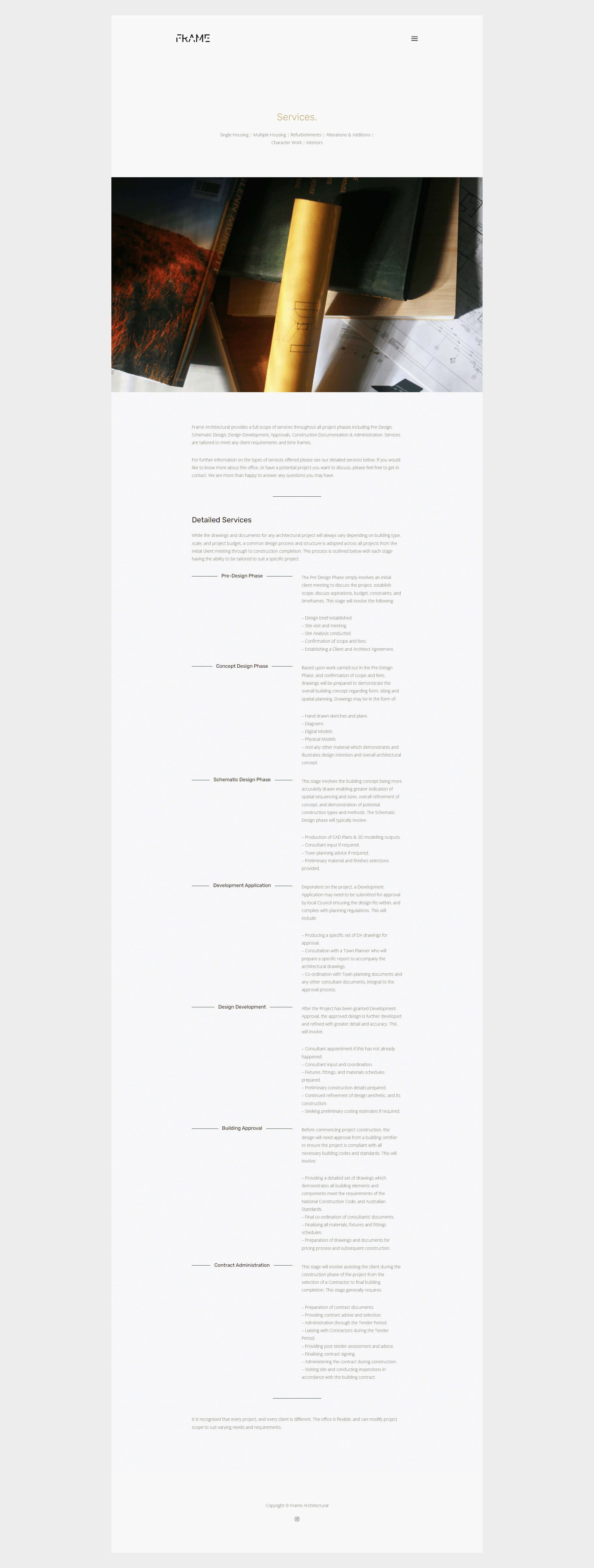
Services Page
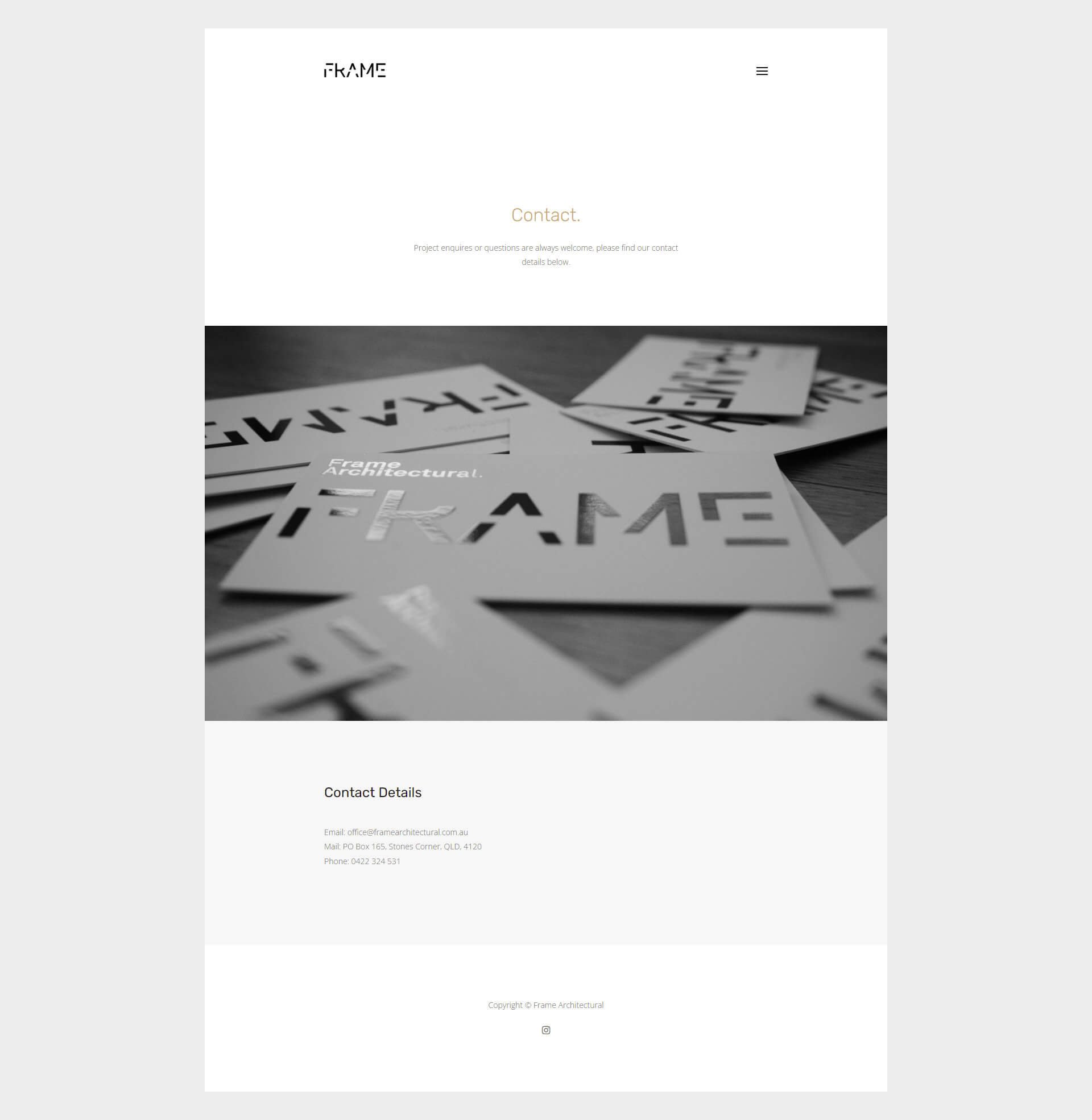
Contact Page
Like the look of what we created for Frame Architectural? If you're dreaming of a website that not only looks the part but helps grow your business too, take a peek at my Squarespace services or book a call to chat through what’s possible. I’d love to meet you and learn more about your epic business dreams.